You can use the time_unit argument to display counts for different time frames, e.g. time = "day" will give a chart where each bar represents the volume counts for a day. To give the bars new colours, enter a string into bar_colour = , the string should be a hexcode e.g. "#440154FF" or the name of a colour e.g. "midnightblue"
Arguments
- data
Data Frame or Tibble object
- date_var
Date column
- plot_type
Should the plot be shown as a line or a bar chart?
- colour
Colour of line/bars - string, name of hexcode
- time_unit
A single unit of time fed into lubridate::floor_date "week", "day", "month","quarter", "year"
- smooth
Add a smoothing line (geom_smooth) to the plot?
Examples
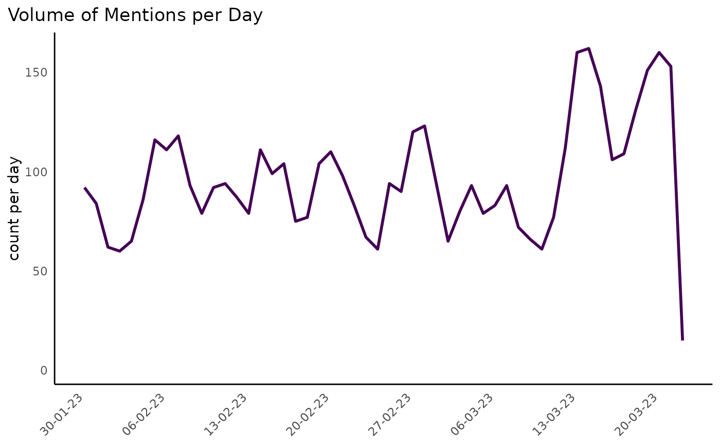
DisplayR::disp_example %>% dr_plot_vot(date = date, time_unit = "day")
#> Warning: Removed 1 row containing missing values or values outside the scale range
#> (`geom_line()`).
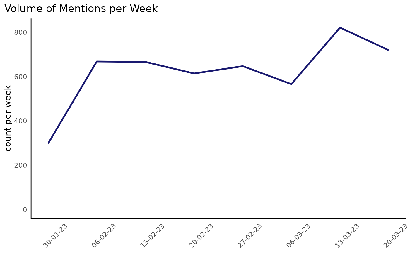
 DisplayR::disp_example %>% dr_plot_vot(date = date, colour = "midnightblue", time_unit = "week")
#> Warning: Removed 1 row containing missing values or values outside the scale range
#> (`geom_line()`).
DisplayR::disp_example %>% dr_plot_vot(date = date, colour = "midnightblue", time_unit = "week")
#> Warning: Removed 1 row containing missing values or values outside the scale range
#> (`geom_line()`).